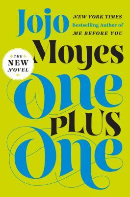
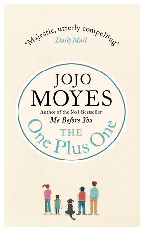
Jasprit and I are back with another Cover Fever and I'm featuring a book I just recently read and loved: One Plus One by Jojo Moyes. Wish I could say the same for the US cover, which in my opinion doesn't fit the story and doesn't attract readers to pick it up. But maybe that's just me. Jasprit and I will weigh in with our choice, but we'd love to hear your opinion, too! Let us know what you think in the comments below
US Cover UK Cover


Australian Cover Swedish Cover


Rachel:
Well as I said I don't care for the US Cover and I think it does little to attract readers. It fit the story at all. The UK version is a little better because at least we have all the characters represented, but it wouldn't call to me at a bookstore. The Australian Cover is actually prettier, and it might catch my eye, but still, I'm not sold. The Swedish Cover is the most suited to the story with the open road (it's a road-trip book) and the little girl doing math problems fits well with Tanzie being a math whiz. I like the road hugging the water and beautiful countryside, and I'd be tempted to pick this book up to read the description.
Rachel's Verdict:
The Swedish Cover.
Jasprit: I actually haven't read this book yet, so don't really know which cover would suit the book best. I'm really weird when it comes to book covers, sometimes I'm all for the cover matching the story and sometimes I just want a pretty cover. I think the UK one is just a bit too simple for my liking, the Swedish cover is pretty neat, but I don't think I would be the tempted to pick it up in a book store, the Australian cover is quite pretty too, but again I'm not finding the cover that appealing. The US cover is really bright and in your face with its big fonts, but I like it, I think I've seen a few of JoJo's covers like this and wouldn't mind having a matching set on my shelf!
Jasprit's Final Verdict:
The US cover.
I like how Rachel and I have really differing opinions this time around, which cover do you prefer?


15 comments:
I'm not a fan of the US cover, but I think I like the UK cover. None of these covers are particularly eye-catching though.
It's a tie between the US/UK cover for me. I like the simplicity from the US one, but I don't care for the color scheme. The UK cover has a nice feeling to it.
I like the typography of the US cover, but the blue doesn't seem to fit the green background at all, and it hurts my eyes a bit. I don't like the fonts for the UK cover, but I love the simple art. So cute. Not a fan of the Australian and Swedish covers...The thing is, I wouldn't pick up any of these covers at the bookstore. *_* But I think I prefer the UK one!
I.. well. I wouldn't buy any of this covers :\ might be because I know I won't enjoy this book, hah (A) but I'm glad you liked it :) But hmm. Favorite of them.. I think the UK cover is cutest :)
Oh interesting covers. In my opinion Swedish Cover is the prettiest, but I think that after reading the story the UK one would make more sense :) Although, I'm really curious to see the cover for Serbian publication, once it's out. Great post, ladies :)
You're right! The US cover doesn't accurately represent the story at all. I thought it was more literary, and definitely didn't pick up "road trip". My favorites are Australian and Swiss too.
Great post!
I'm not a fan of the US cover only because it seems like they're trying to start a trend with Jojo's books because it's far too similar to her Me Before You cover. I'm thinking the best is the UK cover because it reflects the book more than any others BUT it's really far too simplistic.
I think I'd be most interested in the Australian cover. It's just kind of nice.
I like the US cover, mostly because I like those two colors together -- they're very eye-catching. But I do like the UK cover for its cutsie look.
The US cover definitely gets my attention. Those colors are good because it's eye-catching. If I saw it in a bookstore, my eyes would zero in on it because that green isn't a color that's normally used. It's very simple and minimalist.
I like the UK version because of the illustrated family, but the beige coloring is plain and boring.
usa all the way
I actually like the Australian cover because the splashes of color reflect the story so well just as the black-and-white portrays the loneliness of the woman on the cover. I do love both the US and Swedish covers too, though--I wouldn't mind having any of them on my shelves--so fantastic post as always, ladies!
For me, the UK cover. Maybe because it's the version I have. I don't care for the US versions of Moyes books. But it is nice that they all have a similar look, so if your read one, you'd know the others were by her. STILL, I'm not sure I like that the graphics make it similar to Me Before You, which is a book that destroyed me, while this one was way more uplifting. I'm a huge fan of this post!
Personally I think I would be more likely to pick up the Australian or UK cover because I like the simple elegance of them. I love bold, bright covers, but I fear if I had a collection of different books, the US one would stand out and look a little bit odd, especially if I had more Jojo books that did not have the same style covers, because publishers are forever changing covers (so frightfully annoying!)
OOO I definitely like the UK cover. I'd only seen the US one before, and I didn't realize how nice all the other ones are! I would definitely pick any of them up before I would the US one.
Cassie @ Happy Book Lovers
Post a Comment